 Pigment
Night Cartridge
Updated 2026-10-19A 16-bit console booted as a product: night-blue ground, cream pixel type for Hangul and Latin, hard-edged game windows, an RPG menu marker and small pixel scenes that move in stepped frames. Suits docs, dev tools and playful products.
On a real product
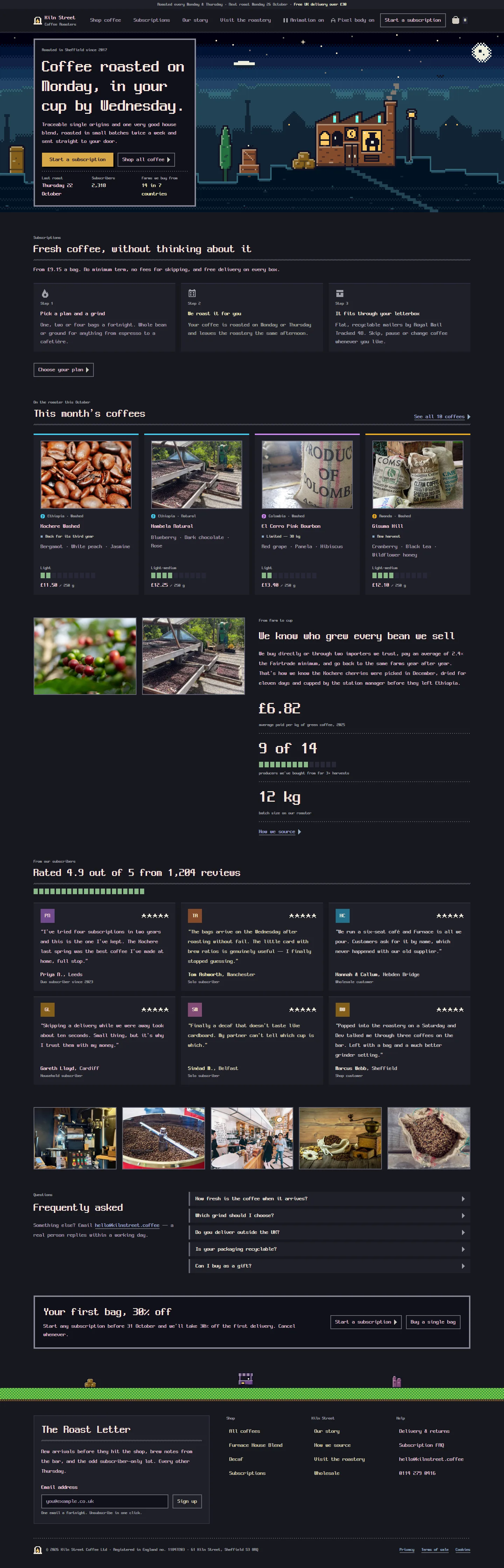
Three products with their own design, and the same products after a coding agent applied Night Cartridge. Pages, copy, photos and features are the product's own; everything you see change is the system.
Color
Type and shape
Components
Every component and its states
Changelog
Setting a system up keeps its whole spec (design-system/agent.md) and tokens in your project, and every later screen is built from that copy. Updates here never restyle a project on their own — ask your agent to update and it applies only what changed since your copy.
- 2026-10-19current
Night Cartridge now fits any product. The rules that were written around example screens are rewritten for the kind of screen or item they describe, and the drawing rules say what to measure instead of what to draw. The look itself is unchanged.
Details (5)
- Item drawings: one outline around one connected shape, 2 to 3 defining parts, 19 to 23 visible units wide. The ink fills 40 to 50% of the picture window at every grid width and on detail pages; a tall item gets taller, never narrower, and the ink ratio is computed from the code. Attached parts (arms, handles, straps, legs) are drawn extended, 3 or more units outside the body's width, and the name test fills the silhouette in one colour and checks that every defining part is still its own lobe. Items in one category differ in outline.
- Block meters are for progress against a real, fixed maximum (a quota, steps done, capacity). Search and filter result counts stay caption text.
- Scenes: each kind of screen has its own scene; detail pages of one kind share one banner and vary its sign word by category. The world comes from the product's own domain.
- Panels side by side end level by adding to the shorter one or trimming the longer one with a "View all" link; widths follow content. KPI tiles share one row and wrap evenly. Two-column layouts let the shorter column stick or grow.
- Item cards show their summaries whole up to 3 lines. A small standalone form is a framed light panel under a section heading.
- 2026-10-18
Scenes and drawings now read at a glance and fit any product. The scene world is derived from your product's own domain, every screen and every detail page gets a scene of its own, and item drawings fill their picture and read by their outline alone. Controls side by side share one height, and three recipe values that pointed at nothing now work.
Details (6)
- Scenes: the world comes from the product's domain (the place its work would happen, at night, with 4 to 6 kinds of building), not from a fixed set. The hero's lead building shows 3 or more defining features and a real sign (one word of at most 4 letters, a pictogram or nothing), never letter-like marks. Every screen and every detail page has its own lead and arrangement; a mirrored, recoloured or relit scene does not count as a new one.
- Hero on phones: the crop centres on the lead building with sky above it; the hill gets a lit rim and a stepped path.
- Item drawings: the visible ink fills 40 to 50% of its picture window, in grids and on detail pages alike; one outline around one connected shape; attached parts (sleeves, handles, straps, legs) join the body and angle away from it; items of one category differ in outline, not only in colour; every drawing passes a name test at 1x.
- Controls: buttons and fields in one row share
size.control(40px), frame included; the large gold button stands alone on its row. - Cards: item summaries show whole up to 3 lines (tiles keep 2).
- Recipes: the gold button's border uses a defined token, and the per-instance values of the rare blink and of the callout accent are stated, so none of them silently drops out.
- 2026-10-15
Night Cartridge is now dark only, like the console it comes from. The light day theme is gone: apps stay on the night palette whatever the device setting, with no theme switch. Product pages get their own scene, and product drawings are easier to recognise.
Details (5)
- Appearance: the day theme is removed (its palette, sky colours and token file);
tokens.csssets the night values on:rootwithcolor-scheme: dark, and never follows the device setting. Remove any light theme or theme switch the app had. - Scenes: the short strip is only for store grids, carts, dashboards and settings; product detail, article and about pages take the banner. Two screens never show the same scene.
- Product drawings fill 40 to 50% of their picture window and read by outline alone (a pan is round with a rim and handle).
- Charts: bars at most 40% of their slot, a 12px axis with 3 to 5 values, never heavier than the KPI numbers.
- The hero's hill gets a lit top edge; on settings, forms share one width with the scene window above them.
- Appearance: the day theme is removed (its palette, sky colours and token file);
- 2026-10-15
First release of Night Cartridge: a 16-bit console booted as a product. A night-blue ground, cream pixel type that sets Hangul and Latin on one bitmap grid, hard-edged game windows, an RPG menu marker, and small living pixel scenes that move only in stepped frames. A derived parchment "day" theme comes with it.
Details (6)
- Ten defining rules and a Never list: everything on the pixel grid (radius 0, 2px and 4px borders, hard shadows), quantized colors, one pixel typeface at weight 400, and gold reserved for the one primary action, the marker and the focus ring.
- Pixel scenes built by recipe: layered sky, haze and ridges, a focal group with clustered props, a hand-placed detail pass (lit windows, signs, textures, stars, small life) and a review at twice the size before they ship. Heroes, banners, strips, figures and empty-state vignettes each have their own sizes.
- Stepped motion only: loops live in the art and status lights, controls respond instantly and press down 2 to 4px, and reduced motion or the animation switch freezes every scene on its first frame.
- Game-window chrome: framed windows, dithered heading rules, dotted separators and block meters for real counts and limits.
- Pixel type with Hangul rules (no breaks inside words, 28px prose leading) and a switch to a readable body face, all openly licensed.
- 13 specified components with designed states, and layout rules for dashboards, stores, articles and settings.