 Pigment
Margin Notes
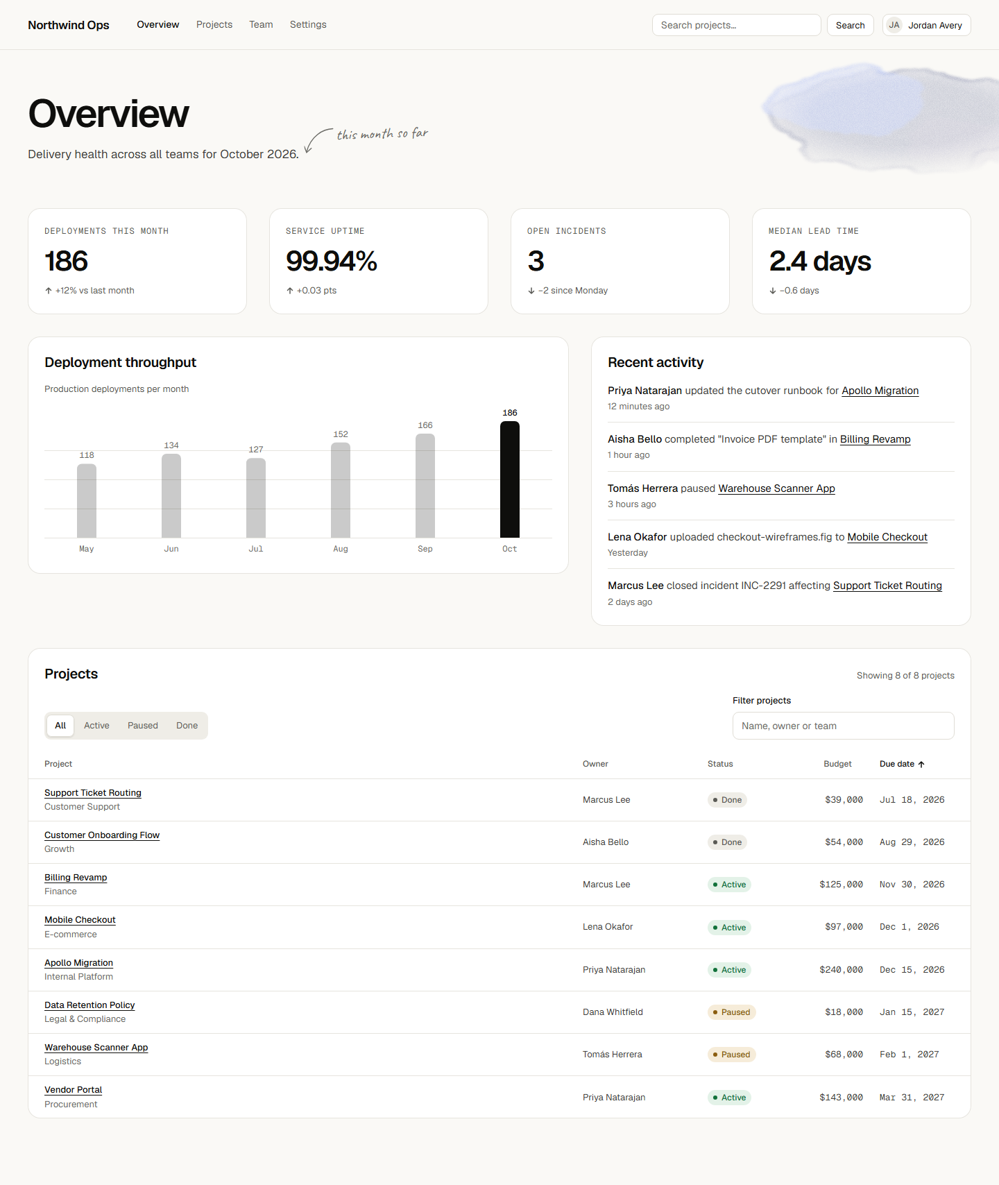
Updated 2026-10-12Warm paper, near-black ink for every action, hairlines and a tightly tracked grotesk; the only color is a watercolor wash, tape and pencil notes kept to the margins. Suits products whose content should carry the color.
Built with this system
Color
Type and shape
Components
Changelog
Applying a system copies its tokens and rules into your project's design-system/ folder, and every later screen is built from that copy. Updates here never restyle a project on their own — ask your agent to update and it applies only what changed since your copy.
- 2026-10-12current
First release of Margin Notes: warm paper and ink, hairlines, a tightly tracked grotesk, and studio details (watercolor bloom, tape, pencil notes, one serif word) kept to the margins, in light and "night paper" dark. Ten defining rules, a Never list, 18 specified components with designed states, copyable recipes for every studio detail, and agent instructions for new and existing projects.
Details (13)
- Checkbox, radio and switch: the native input is the visible control (
appearance: none, classcheck/switch), so it takes every click; drawn boxes and thumb spans getpointer-events: none. Never list: a decorative layer that intercepts clicks on a native control. Verification: click each one with the mouse. - Segmented control: new tokens
color.surface.selected(dark#38362f, lighter than the track) andcolor.border.selected(dark ring 4.6:1 on the track); the selected segment carries the ring in both themes. - Hatch toned down:
color.decor.hatchlight#d4cfc4(1.25:1 on the tray), dark#3f3d37(1.34:1), 10px pitch, stated range 1.15:1 to 1.35:1; grids of 3 or more asset-less frames use 3:2. - Linked-card hover: 1px
color.text.tertiaryring plus title underline (was an invisible border step). - Search fields hide the browser clear button; the system's own clear button is specified. Native selects drop the default arrow. Never list: browser-default chrome.
- Focus rings never touch text: header links are padded
size.controlSmboxes; inline links get padding and a 3px offset. - Success feedback: a toast, or a success badge with a check icon for in-place status text; never a bare colored word. The toast covers every save and submit.
- Dialog: exact centering CSS for native and custom dialogs, mobile width, initial focus ring visible.
- Hierarchy: h1 repeats moved to the Never list with the "Projects / All projects" example; state markers ("Current plan") are neutral badges, never button-sized ink; the article table of contents is a right rail or a collapsed "On this page" after the meta line, never between breadcrumb and h1; headings balance-wrap.
- Spacing: card grids
align-items: start, cards span only the columns their content fills (no card more than 30% empty); the mobile action bar is fixed to the viewport at full width; tables usetable-layout: fixedwith column widths so filtering moves no column; inline badges getspace.8. - Mono rule: numbers inside sentences and status lines stay sans.
- Contradictions resolved: serif words are allowed in blog post titles but not on product, project or record pages; pencil-note words must restate their target (per-app wording given; the store note no longer prescribes fixed text); the settings note sits inside the sidebar (
--note-x: space.16). - Budget: shadows written with 8-digit hex, unused tokens removed (
color.action.disabled,color.code.ring,font.size.display,font.tracking.normal,size.rowCompact), prose compressed; bundle 5,993 words.
- Checkbox, radio and switch: the native input is the visible control (